The post made me think about the old days and all the different versions of Axapta we've had a chance of working with in the past. And yes, it made me a bit nostalgic. I thought I share with you some of the artwork of old Axapta versions. Maybe you can remenisce as well, or just get an idea on where Ax comes from.

The Axapta program icon, as used in versions 1.0 and 1.5.
(Note: The demo data included at that time, we are speaking 1998-1999, was a whopping big 5Mb DAT file...)
The main menu from version 1.5 has, for todays standards, a very basic look-and-feel.

With version 2.5, you could say Axapta went into its "orange" phase.
The Axapta program icon in version 2.5
![]()
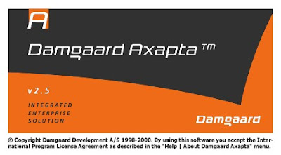
The splash screen from version 2.5:

The main menu, as used in version 2.5.

By that time, besides building it's own modules, functionality from third parties was already integrated in Axapta (see the Shop Floor modules in the print screen).
As you can see by the number of tabs in the main menu, less was more those days.
After the release of version V.25, Damgaard regrouped the functionality. (For example: customers and sales go together, like items and BOM.) This made the size of the main menu somewhat controllable in version 3.0.
Note: We never really went LIVE with version 1.0 or version 1.5. We used version 1.5 for demo purposes internally, used version 2.0 to test and to start up with. Pretty soon after that came version 2.1.


No comments:
Post a Comment